New Format of BCO is a DISASTER
Comments
-
Just came on and initially I thought the old format was back...was about to come on and comment: thank you thank you thank you! But no! If it's not broke..don't fix it! I think you probably could have left it alone and created a different version for mobile devices.
-
Jancie, I found a clue.
I pulled up the "All Topics" page in Firefox v. 3.0.19 on my MacBook Pro, and took a photo of it. After uploading via Photobucket, here's what it looks like. Sorry -- it's still fuzzy for some reason, but you can see there's no left margin or nav bars on this page:
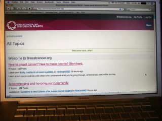
Okay, so then I pulled up the same "All Topics" page in Safari v. 3.0.4, which is an ancient version of that browser that came with my laptop. After taking a pic and uploading it in Photobucket, I brought it here -- also fuzzy, but with a completely different layout:
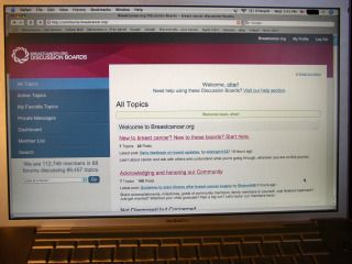
Now, why would those be so different? This does appear to be a browser-specific problem, because you're looking at the same laptop running the same version of Mac OS X (v. 10.4.11) in either case.
otter
ETA: I've been playing around with the Safari version since I posted those pics above. Compared to the full-screen, all-white, no nav bars version I see with Firefox, the Safari version is much more user-friendly. That left-hand column with the nav bars and drop-down menu could be narrowed, to allow more page width for the titles and posts, but I do like the options that version provides. (That's what we're supposed to be seeing, I suspect.) One drawback to the full-service version in Safari is that I cannot use control-plus or control-minus to re-size the text in the titles or posts as I can with the Firefox version. There's a glitch in there, somewhere, for the techies to fix.
-
I really hate the new format and feel I'm being forced to make one more big adjustment to accomodate my breast cancer. Who's bright idea was this, anyway? Did you take into consideration that we rely on our routines with their familiarity/predictability for much-needed comfort? Sorry, but I just don't have the energy to learn to navigate one more convoluted healthcare system. You essentially took away my support system and I resent that.
-
On my smartphone... I think the reason why my eyes are bugging out... Is because there are so many different font sizes and boldnesses in the fonts. Under our replies, our signatures are a light font. Our replies are another. There just seems to be so many colors and fonts. It's too busy. And don't get me started with the scrolling. My finger was first blistered. Then calloused. Now it is Charlie-horse!
-
BTW, I regularly used BCO on IPad and IPhone and had no problem navigating either. The new format has NOT accomodated my mobile use...it has created one more BIG problem in my life. When I log in, I see all the info that used to be immediately...as in on the Forum Listings page...visible is missing and feel like I'm entering a corn maze to search for what I should already see...and there is NOTHING intuitive about the process. It requires more time and energy than I have and I fear a lot of people will not be getting the support they deserve...including me. And we can't reclaim the old format WHY? Because it is better to proceed with a massive mistake than to call it a loss and correct one's course?
And...I learned Ipad and Iphone navigation easily. I'm not technically challenged but don't let me login to my primary support system to find it is now a corn maze! Such arrogance! -
I did everything I was suppose to as far as I know it and I am still getting e-mail notifications.....I just deleted 98 of them!!!!!!!!!!!!!!!!!!!
-
Thanks for sharing the information about how the new format appears in different browsers, on the same machine. We will forward it to the tech team, but one thing to try is to reset the zoom in Firefox. To do that, click on View and then either zoom out or simply reset zoom. It should reduce the size of the information visible in your browser window. Just let us know if this helps or not.
We continue to work on improving/fixing the new format. More updates to follow.
Thanks for your patience!
-
What if we don't want you to keep working on improving/fixing the new format? You haven't said anything about the chance of getting the old format back. Is that even a remote possibility? Some kind of yes, no, maybe would be great.
Don't get me wrong, I really do appreciate the effort you are making to "improve" the site, I think we all do, but this is just to much for a lot of us to deal with right now.
We, or I anyway, really like the few things in my life that don't have to change right now, and this is one of them.
-
Make users responsible for trouble shooting your Massive Mistake? Groan...
-
Re: "...simply reset zoom. It should reduce the size of the information visible in your browser window."
Well, yes... that's exactly what it does. But that does not solve the problem.
I tried resetting my zoom (LOL) to see if it would bring up the gray left-hand column and the wonderful nav bars, which is the problem I'm having in Firefox. As I've mentioned and illustrated (above), all I see with Firefox is the beige/gray/white screen with wall-to-wall text -- the same stuff everyone else (except Jancie) sees inside the white box on the right half of their screens.
Resetting or decreasing my zoom just makes the print smaller. Same all-beige/gray/white screen, same wall-to-wall text, only now it's so tiny I can't read it.
otter
-
OK- otter- sending the information to the techs
-
Another complaint; when I click 'Back to Top', I do not go back to the top. Don't go anywhere.
-
Otter - what you are seeing in Firefox is the same identical screen that I am seeing. Gosh darn this bright white screen is messing with my eyes!
I don't know anything about Safari - I have no clue what that is and I am not one to start downloading programs on this computer!
If it worked before correctly - it should work now!!! I am getting extremely frustrated!
-
Dear mods, would your tech team consider a rollback to the old format whilst they iron out the glitches and test more thoroughly in a controlled environment, and then roll out changes gradually? I think the complete overhaul has thrown many of us, whereas a drip feed approach makes any bitter pills easier to swallow, and any problems easier to focus on and resolve. Their bug list per browser and device must currently be enormous and will take ages to resolve anyway, so why not make it a bit easier on the users?
For whats its worth, the reason I ended up here in the first place was the UK sites and forums I came across were hard to navigate. I would hate bco to go the same way as I think it is an invaluable resource, and the people on here are the best :-).
If the policy is that any rollback is totally out of the question then people can decide whether they can deal with the changes or if they need to look elsewhere. I hope the girls (and boys) decide to stay around. -
I can't see why anyone would say newbies will have a hard time. If you haven't seen BCO any other way, why would they complain? It took me a little while to understand how BCO worked - like the many forums with threads in each one, but I managed. I don't think the new format will make any difference to newbies.
-
WHAT on earth is the point of all that grey space on the left hand side??
The old format had posts in different colours - alternating beige and buff, or some such.....really easy on the eye. My eyes are watering as I type this, and I have only been browsing for a very short time.
Maybe the reason why most of my posts 'disappeared' is because there was a lot of behind-the-scenes tinkering going on; I joined in Oct 2003 and have made many, many more posts than it says under my name.I haven't looked around yet, but wonder what else has disappeared.
Please, please, mods, let us have the old format back....
-
In my opinion, the Active Topics page does not hold the same number of posts per page it used to. I think for that reason some new posts will get lost in the shuffle. I liked viewing a whole lot of posts per page.
I liked having the posts I went to in Active Topics highlighted. They aren't any more. At least not from my computer.
-
How do we find our old posts? I've looked under my name in the search, and nothing shows up even though I've posted in a few threads today.
I also tried another poster's name just to see what happens, and three threads showed up from a year ago, but nothing recent, and I picked a poster who has several new posts.
There must be something I'm not getting.
-
I must admit, it does seem a little faster today. And the Post a Reply is bigger.
-
Ok. I found the old posts in "Dashboard." I'm trying here, really.
I suggest that the techs put this information in the "help" section that is next to our name on the opening page.
-
It seems to me the reason why there are not as many posts on the page is because there is more spacing (for instance between paragraphs). I personally feel the individual posts read better because the line spacing is now appropriate for the text size. This IMO is great but then on the All Topics or Active Topics this takes up more space. The way the site is design if they change one they change the other. Overall from what I'm looking at it really is a better read.
-
The nice thing is with a responsive "design", when I get tired of reading 32" across my screen I can grab the right corner and shorten the width of the window and the design collapses into a shorter width layout. Now I can read it more easily. Moderator: Thank you for mentioning that or I wouldn't have thought to try it.
I am still finding a lot to not like about this though.
-
sandilee, we've asked the tech folks to look into what's going on with finding newer posts using Search.
J-Bug, I love being able to make the overall width narrower too! Although I'm experiencing monitor envy over your 32" screen.

-
Okay , just had to delete 93 e-mail notifications and now will have to figure out how to get rid of them entirely from my laptop. My DH is having a fit, I am about to have a fit. I followed the instructions as to how to refuse the notifications and obviously it didn't work. I acan't imagine why anyone would think it is a good idea to send unsolicited material on this forum--we get enough of that through regular E-mail. Whose bright idea was that and for what purpose? This is just an unacceptable invasion of privacy. This whole change just is nuts.
-
I have a 32" monitor and I make the screen SMALLER. Otherwise it's like reading subtitles in the first row of the movie theater. Funny how you haven't replied to my complaint of the fonts... Btw... My brother is a digital artist and the DH is an electrical engineer and computer analyst. Been involved with computers since there were mainframes. What ever it is you are doing is insulting. I am telling you why everyone is bug eyed.... are you listening or are you waiting for people to get a migraine and leave? And all the scrolling??? Shut down your experiment. We shouldn't have to be telling you over and over again that while your system is running faster it is still a fiasco.
-
I don't like it as well either. Once you get into a thread to read posts, it seems okay, but the favorites page and the active topics page. . . well, it just takes too much scrolling. I like to see the "big picture" all at once. Then I can click on what I want. Also, I don't like having the names of the last poster listed first--I'd rather see the post first. Isn't that what is important? I also miss how it used to be more in a grid-like format. It seemed to separate everything a lot better.
-
voraciousreader, sorry we missed your question about the fonts; I'll go looking for it, thanks!
-
Voraciousreader - little bit harsh but I can understand your frustration. I've been 'in' computers since 1971 and do have a lot of UI design experience and this is not a good design at all.
I get tiny font at work and big font at home - what's up with that?
I haven't had any auto emails but I did notice the' Back to Top' link didn't work.
The idea of going back to the old format is good and you could get some of us to be beta testers for any new designs before you release it to the world at large.
-
The new format seems like it is a waste of space especially the headings. The topics take up too much room as well as each post. I like to never found the loggin screen. I don't mind change but this is really drastic.
-
Has anyone tried to upload a new avatar? I tried with both IE and FireFox, got the same error message on both attempts. I routinely upload pictures and never have a problem. I think the message said something like "not on the list" of something similar. Can someone else try and report back?
The format looks nice on my Android phone.


Categories
- All Categories
- 679 Advocacy and Fund-Raising
- 289 Advocacy
- 68 I've Donated to Breastcancer.org in honor of....
- Test
- 322 Walks, Runs and Fundraising Events for Breastcancer.org
- 5.6K Community Connections
- 282 Middle Age 40-60(ish) Years Old With Breast Cancer
- 53 Australians and New Zealanders Affected by Breast Cancer
- 208 Black Women or Men With Breast Cancer
- 684 Canadians Affected by Breast Cancer
- 1.5K Caring for Someone with Breast cancer
- 455 Caring for Someone with Stage IV or Mets
- 260 High Risk of Recurrence or Second Breast Cancer
- 22 International, Non-English Speakers With Breast Cancer
- 16 Latinas/Hispanics With Breast Cancer
- 189 LGBTQA+ With Breast Cancer
- 152 May Their Memory Live On
- 85 Member Matchup & Virtual Support Meetups
- 375 Members by Location
- 291 Older Than 60 Years Old With Breast Cancer
- 177 Singles With Breast Cancer
- 869 Young With Breast Cancer
- 50.4K Connecting With Others Who Have a Similar Diagnosis
- 204 Breast Cancer with Another Diagnosis or Comorbidity
- 4K DCIS (Ductal Carcinoma In Situ)
- 79 DCIS plus HER2-positive Microinvasion
- 529 Genetic Testing
- 2.2K HER2+ (Positive) Breast Cancer
- 1.5K IBC (Inflammatory Breast Cancer)
- 3.4K IDC (Invasive Ductal Carcinoma)
- 1.5K ILC (Invasive Lobular Carcinoma)
- 999 Just Diagnosed With a Recurrence or Metastasis
- 652 LCIS (Lobular Carcinoma In Situ)
- 193 Less Common Types of Breast Cancer
- 252 Male Breast Cancer
- 86 Mixed Type Breast Cancer
- 3.1K Not Diagnosed With a Recurrence or Metastases but Concerned
- 189 Palliative Therapy/Hospice Care
- 488 Second or Third Breast Cancer
- 1.2K Stage I Breast Cancer
- 313 Stage II Breast Cancer
- 3.8K Stage III Breast Cancer
- 2.5K Triple-Negative Breast Cancer
- 13.1K Day-to-Day Matters
- 132 All things COVID-19 or coronavirus
- 87 BCO Free-Cycle: Give or Trade Items Related to Breast Cancer
- 5.9K Clinical Trials, Research News, Podcasts, and Study Results
- 86 Coping with Holidays, Special Days and Anniversaries
- 828 Employment, Insurance, and Other Financial Issues
- 101 Family and Family Planning Matters
- Family Issues for Those Who Have Breast Cancer
- 26 Furry friends
- 1.8K Humor and Games
- 1.6K Mental Health: Because Cancer Doesn't Just Affect Your Breasts
- 706 Recipe Swap for Healthy Living
- 704 Recommend Your Resources
- 171 Sex & Relationship Matters
- 9 The Political Corner
- 874 Working on Your Fitness
- 4.5K Moving On & Finding Inspiration After Breast Cancer
- 394 Bonded by Breast Cancer
- 3.1K Life After Breast Cancer
- 806 Prayers and Spiritual Support
- 285 Who or What Inspires You?
- 28.7K Not Diagnosed But Concerned
- 1K Benign Breast Conditions
- 2.3K High Risk for Breast Cancer
- 18K Not Diagnosed But Worried
- 7.4K Waiting for Test Results
- 603 Site News and Announcements
- 560 Comments, Suggestions, Feature Requests
- 39 Mod Announcements, Breastcancer.org News, Blog Entries, Podcasts
- 4 Survey, Interview and Participant Requests: Need your Help!
- 61.9K Tests, Treatments & Side Effects
- 586 Alternative Medicine
- 255 Bone Health and Bone Loss
- 11.4K Breast Reconstruction
- 7.9K Chemotherapy - Before, During, and After
- 2.7K Complementary and Holistic Medicine and Treatment
- 775 Diagnosed and Waiting for Test Results
- 7.8K Hormonal Therapy - Before, During, and After
- 50 Immunotherapy - Before, During, and After
- 7.4K Just Diagnosed
- 1.4K Living Without Reconstruction After a Mastectomy
- 5.2K Lymphedema
- 3.6K Managing Side Effects of Breast Cancer and Its Treatment
- 591 Pain
- 3.9K Radiation Therapy - Before, During, and After
- 8.4K Surgery - Before, During, and After
- 109 Welcome to Breastcancer.org
- 98 Acknowledging and honoring our Community
- 11 Info & Resources for New Patients & Members From the Team