New Format of BCO is a DISASTER
Comments
-
sandilee - your inference that all who use a mobile phone do not type or do any serious writing on their phone is wrong. I only use my 'droid and if the research is showing that 25% of the use is with mobile phones that is at a fair bit of use that do deserve to be considered. I'm sure they willl be able to figure out the glitches.
Is everybody going like the new - NO, will it take time to get used to it and the bugs worked out - Yes. -
I love Day's idea. Paying for someone's treatment would be a way to spend donated money without wasting it. The mods would have done better with the money spent on this if they had thrown it out a widow. Edited to say WINDOW WINDOW not widow
-
Please,please,please put it back the way it was. It was perfect
-
I had a lump under my bra at one point.
")
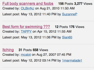
I think otter said it best. I'm not great at trying to explain when I can't do a side by side comparison. The thing that bugs me the most is when you view active topics, you don't see the table format, but you see four posts. About half of our members have joint pain from hormonals and that is a LOT of scrolling. This is supposed to be a board where we have conversations - it should be easier to do that, not harder.
-
Seriously how on earth do I turn off email notifications... I finally found my profile and none are checked - do not know why this is happening but they are coming fast and furious and it is awful! I will just have to delete everything as this is crazy. Help please!
-
This new format is killing my eyes. What is with all this grey and white? As others have said, there is lots of wasted space and this new format is not nearly as efficient as the old format. I hope the mods either change this set-up tremendously or just go back to what was working to begin with. Can't type anymore... the bright screen is hurting. :-(
-
We never got ignore thread/forum customization, but we go tthe chance to post private information - while the mods tell us to please be careful about posting private information.
Methinks the left hand needs to speak to the right. :-)
Facebook/smartphone app culture don't mesh well with cancer, sorry. Especially this relatively older and wiser crowd.
I can't believe my profile would even give me space to write my REAL name and real birthday plus SCUEDULE FO SURGERIES?? And the TOS continue to give BCO very expanisve rights to our info. Sorry, but you are exposing yourselves and your users to lots of grief.
A legal team need to be on this.
Ok. I think I'm ready to answer Day's question. See her thread asking people to simply say "yes" or"no" to returning to the old way.
I'm sorry this didn't work out. I did like the colors, and I won't enjoy going back to pink....but I prefer it.
-
How to turn of notifications from favorite topics.
go to "My Favorite Topics"
on the right of the topic you'll see:
X Remove from My Favorite Topicsunder that you'll see:
"remove email notification"^click that
----------------------------
Boy do I wish they beta tested this new design with members before it went live!
-
Don't like the new format!
-
Iago !!!! THANK YOU!!! I was going crazy! Hate this and I agree I'm signing off with a pounding headache!
-
Okay, we are really hearing you. If you need to add something that hasn't already been said, please do so. Otherwise, we've got it documented and are working on it. The team will be able to discuss everything tomorrow. But tonight, nothing can really change too much (ti is late where we are).
Thanks for your understanding!
-
I want to use the new forums for awhile before I decide how I really feel about them-- I know that change is hard. But one thing I want to mention to the mods to pass along:
I like that you can "collapse" categories under the list of forum sections. This makes it especially nice on smaller screens. BUT the categories need to be re- thought. For example, there is a whole category of forum topics for similar diagnosis ie, IDC, Triple Neg, etc. Only one or two of those are of interest to me and my personal diagnosis. But if I collapse the category, I cant see any of them.
It would be awesome if we could create our own list of categories we want to see on our own dashboard. Not just favorite topics. I mean that I would like to say, show me active topics in Stage IV, Singles with BC, and xyz... or say, Ignore the categories Stage 1, II, III. Does that make sense? -
This new format is like --- when you hire an Interior Designer to re-do your house, and the designer entirely OVER-decorates the house, filling it up ceiling to floor and wall to wall with way too many crowded accessories. I don't see what was wrong with the old format, and i don't see any potential advantage or success in this new format.
-
Interesitng idesas, Petjunkie! Thanks for these suggestions!Passing along to tech team!And thanks Celia and others....
-
I clicked 'Remove e-mail notifications' on all my favorite topics at about 7:30 pm. Just checked my e-mail a couple minutes ago and had 50 new notifications there anyway. I'm figuring my inbox will be overflowing by morning (I'm afraid to take them off my favorite list because I will never find them again!).
-
Okay, we're working on this! Thanks for your feedback!
-
Re treatments:
the list of chemo names is mixed between brand name and chemical. There is no way that a newbie would recognize FEC-D by the list of names BCO comes up with. There is no way I would find that list useful even private -- so I deleted.
There is no way to mention short course radiation (3 weeks plus a day rather than five weeks or more) Newbies might like to know about this possibility otoh internal radiation is mentioned.
Why is it necessary to have exact dates listed. This is most annoying because although the entry lists month written out, it displays as numeral, so it is difficult to determine whether a date is dd/mm/yyyy or mm/dd/year. This is an international site isn't it?
-
Great feedback, Kathy044. Will forward along!
-
sorry i dislike this format as well to hard to navigate, was used to the old one.. i dont need the extra stress in my life right now.. please go back to the old one.
-
So is this one of those rollouts where you moderators are not going to get any sleep tonight?
-
I am getting a headache from the brightness of the background. I don't know where people are getting beige, don't know how to change it on my end - my screen is white - a glaring white - too white. My eyes are sensitive to anything bright and this is just not working for me.
Does anyone know how to change the background to a more subdued color?
-
Seriously, in the last 34 minutes I have gotten 15 more e-mail notifications!!!!!!!!!!!!!!!!!!
-
I do not care for it either girls.
-
Mods, i know you guys are working hard on this situation, and i do hope that you can come up with a way for us to see more of the Active topics all at once so we don't have to scroll so much. The site is very very slow and scrolling and changing topics is also really slow.
Earlier, I posted that I tried out this new format on my MAC with a big screen and on my PC laptop and was not happy with the tedious amount of seemingly endless scrolling to find anything. I did notice that the posts were all on the right side of my screen with a lot of wasted space on the left side of the screen. I just tried out the new format with my Droid phone and, although the posts were centered on my Droid screen, the experience of scrolling was even slower and more frustrating and tedious. All i can see on the Droid are 2 posts at a time on the screen. That way it is hard to have any continuity about what you are reading or researching. I have never really liked accessing the BCO site with my Droid because i find the Droid touch screen harder to control than the computer. But now it is really a huge drudge to use the Droid for BCO. I don't think that having "centered posts" on the mobile devices is worth giving up the former "user friendly" format we had.
-
I took care of the email notification problem. I deleted every single one of my "favorite" threads. I still can't figure out how to delete that annoying list of "articles" on my profile page. It's a bit like junk mail, isn't it?
Enough of the technical details. I just miss the old format. It was familiar, like an old friend. Like comfortable slippers, or a well-worn porch swing, or an ancient shade tree or a favorite coffee cup. I knew where everything was here, without even trying.
No more. Some overly-enthusiastic contractor came in with a bulldozer and took down all those old trees, and the buildings with the porch swings. Now we have smart, slick, uncomplicated, modern. It will work better. Be more efficient.
I hate change. There -- I said it. Gratuitous change -- change for the sake of change, as has happened here -- has always made me uncomfortable, but my aversion to change really solidified after my BC dx 4+years ago. I crave stability, familiarity. When I wake up in the morning, I want to reach for my eyeglasses, and find them where I left them. I want to know that the coffeepot makes good, strong coffee; and I want the sun to be coming in the bathroom window. My keys will be on the corner of the desk, and my car will be parked outside the back door.
I am uneasy when I cannot find things -- when they aren't where they're supposed to be.
It takes me awhile to adapt to change. Too long, perhaps. We'll see.
otter
-
But I DON'T want to delete my favorites. Some of them are inactive for a long time and then pop up again. Others are once a week check ins that are going to get lost in this mess, others are daily check-ins that I want to access quickly. This is too sad.
-
Sorry, ruthbru. I didn't mean for anyone else to follow my lead. I just sometimes go to extreme lengths to kill a gnat.
BTW... here's a screen shot of the opening (home) page of the BCO boards, once I login. Is there anyone out there who thinks this is a good-looking page layout? Better than what we had before??? I'm using a MacBook Pro with an out-of-date OS and an equally out-of-date version of Firefox, but why should that matter? Please disregard the fuzzy image. That's how it posted. I'm concerned about the layout -- the spacing, the text placement, the banner colors (what's with that dreadful muddy brown?), all the wasted area.
otter
-
I am very unhappy (to put it mildly) about this new format, also! I agree with what you said, Otter......(copied part of your post here)....
"Enough of the technical details. I just miss the old format. It was familiar, like an old friend. Like comfortable slippers, or a well-worn porch swing, or an ancient shade tree or a favorite coffee cup. I knew where everything was here, without even trying.
No more. Some overly-enthusiastic contractor came in with a bulldozer and took down all those old trees, and the buildings with the porch swings. Now we have smart, slick, uncomplicated, modern. It will work better. Be more efficient."
-
Ruthbru, I'm sorry if you've already answered this but do you see "Add email notification" beside/below each of your Fave Topics?
-
I hate it! I feel like my best friend got a face lift, Lipo, a younger buddy and drove off in her new car, leaving me confused, lost and alone. Come on guys we don't care how updated you look, we want a safe friendly place to come, to laugh, to cry, to bitch, and to share with others who understand. We've faced enough change in our worlds.


Categories
- All Categories
- 679 Advocacy and Fund-Raising
- 289 Advocacy
- 68 I've Donated to Breastcancer.org in honor of....
- Test
- 322 Walks, Runs and Fundraising Events for Breastcancer.org
- 5.6K Community Connections
- 282 Middle Age 40-60(ish) Years Old With Breast Cancer
- 53 Australians and New Zealanders Affected by Breast Cancer
- 208 Black Women or Men With Breast Cancer
- 684 Canadians Affected by Breast Cancer
- 1.5K Caring for Someone with Breast cancer
- 455 Caring for Someone with Stage IV or Mets
- 260 High Risk of Recurrence or Second Breast Cancer
- 22 International, Non-English Speakers With Breast Cancer
- 16 Latinas/Hispanics With Breast Cancer
- 189 LGBTQA+ With Breast Cancer
- 152 May Their Memory Live On
- 85 Member Matchup & Virtual Support Meetups
- 375 Members by Location
- 291 Older Than 60 Years Old With Breast Cancer
- 177 Singles With Breast Cancer
- 869 Young With Breast Cancer
- 50.4K Connecting With Others Who Have a Similar Diagnosis
- 204 Breast Cancer with Another Diagnosis or Comorbidity
- 4K DCIS (Ductal Carcinoma In Situ)
- 79 DCIS plus HER2-positive Microinvasion
- 529 Genetic Testing
- 2.2K HER2+ (Positive) Breast Cancer
- 1.5K IBC (Inflammatory Breast Cancer)
- 3.4K IDC (Invasive Ductal Carcinoma)
- 1.5K ILC (Invasive Lobular Carcinoma)
- 999 Just Diagnosed With a Recurrence or Metastasis
- 652 LCIS (Lobular Carcinoma In Situ)
- 193 Less Common Types of Breast Cancer
- 252 Male Breast Cancer
- 86 Mixed Type Breast Cancer
- 3.1K Not Diagnosed With a Recurrence or Metastases but Concerned
- 189 Palliative Therapy/Hospice Care
- 488 Second or Third Breast Cancer
- 1.2K Stage I Breast Cancer
- 313 Stage II Breast Cancer
- 3.8K Stage III Breast Cancer
- 2.5K Triple-Negative Breast Cancer
- 13.1K Day-to-Day Matters
- 132 All things COVID-19 or coronavirus
- 87 BCO Free-Cycle: Give or Trade Items Related to Breast Cancer
- 5.9K Clinical Trials, Research News, Podcasts, and Study Results
- 86 Coping with Holidays, Special Days and Anniversaries
- 828 Employment, Insurance, and Other Financial Issues
- 101 Family and Family Planning Matters
- Family Issues for Those Who Have Breast Cancer
- 26 Furry friends
- 1.8K Humor and Games
- 1.6K Mental Health: Because Cancer Doesn't Just Affect Your Breasts
- 706 Recipe Swap for Healthy Living
- 704 Recommend Your Resources
- 171 Sex & Relationship Matters
- 9 The Political Corner
- 874 Working on Your Fitness
- 4.5K Moving On & Finding Inspiration After Breast Cancer
- 394 Bonded by Breast Cancer
- 3.1K Life After Breast Cancer
- 806 Prayers and Spiritual Support
- 285 Who or What Inspires You?
- 28.7K Not Diagnosed But Concerned
- 1K Benign Breast Conditions
- 2.3K High Risk for Breast Cancer
- 18K Not Diagnosed But Worried
- 7.4K Waiting for Test Results
- 603 Site News and Announcements
- 560 Comments, Suggestions, Feature Requests
- 39 Mod Announcements, Breastcancer.org News, Blog Entries, Podcasts
- 4 Survey, Interview and Participant Requests: Need your Help!
- 61.9K Tests, Treatments & Side Effects
- 586 Alternative Medicine
- 255 Bone Health and Bone Loss
- 11.4K Breast Reconstruction
- 7.9K Chemotherapy - Before, During, and After
- 2.7K Complementary and Holistic Medicine and Treatment
- 775 Diagnosed and Waiting for Test Results
- 7.8K Hormonal Therapy - Before, During, and After
- 50 Immunotherapy - Before, During, and After
- 7.4K Just Diagnosed
- 1.4K Living Without Reconstruction After a Mastectomy
- 5.2K Lymphedema
- 3.6K Managing Side Effects of Breast Cancer and Its Treatment
- 591 Pain
- 3.9K Radiation Therapy - Before, During, and After
- 8.4K Surgery - Before, During, and After
- 109 Welcome to Breastcancer.org
- 98 Acknowledging and honoring our Community
- 11 Info & Resources for New Patients & Members From the Team